Benchmarking string search algorithms
Searching a sequence of items for occurrences of a specific pattern is a common operation, and researchers are still discovering faster string search algorithms.
While skimming the paper Efficient Exact Online String Matching Through Linked Weak Factors by M. N. Palmer, S. Faro, and S. Scafiti, Tables 1, 2 and 3 jumped out at me. The authors put a lot of effort into benchmarking the performance of 21 search algorithms representing a selection of go-faster techniques (they wanted to show that their new algorithm, using hash chains, was the fastest; Grok explains the paper). I emailed the authors for the data, and Matt Palmer kindly added it to the HashChain Github repo. Matt was also generous with his time answering my questions.
The benchmark search involved three sequences of items, each of 100MB, a genome sequence, a protein sequence and English text. The following analysis if based on results from searching the English text. The search process returned the number of occurrences of the pattern in the character sequence.
The patterns to search for were randomly extracted from the sequence being searched. Eleven pattern lengths were used, ranging from 4 to 4,096 items in powers of 2 (the tables in the paper list lengths in the range 8 to 512). There were 500 runs for each length, with a different pattern used each time, i.e., a total of 5,500 patterns. Every search algorithm matched the same 5,500 patterns.
Some algorithms have tuneable parameters (e.g., the number of characters hashed), and 107 variants of the 21 algorithms were run, giving a total of 555,067 timing measurements (a 200ms time limit sometimes prevented a run completing).
To understand some of the patterns present in the timing results, it’s necessary to know something about how industrial strength string search algorithms work. The search pattern is first processed to create either a finite state machine or some other data structure. The matching process starts at the right of the pattern and moves left, comparing items. This approach makes it possible to skip over sequences of text that cannot match. For instance, if the current text character is X, this is fed into the finite state machine created from the pattern, and if X is not in the pattern, the matching process can move forward by the length of the pattern (if the pattern contains an X, the matching process skips forward the appropriate number of characters). This pattern shift technique was first implemented in the Boyer-Moore algorithm in 1977.
One consequence of skipping over sequences that cannot match, is that longer pattern enable longer skips, resulting in faster searches. The following plot shows the search time against pattern length for two algorithms; total time includes preprocessing the pattern and searching the text (red plus symbols have been offset by 10% to show both timings; code+data):
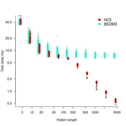
Why does the search time for HC3 (one variant of the author’s new algorithm) start to plateau and then start decreasing again? One possible cause of this saddle point is the cpu cache line width, which is 64 bytes on the system that ran the benchmarks. When the skip length is at least twice the cache line width, it is not necessary to read characters that would cause the filling of at least one cache line. As always, further research is needed.
What is the most informative method for comparing the algorithm/tool performance?
The most commonly used method is to compare mean performance times, and this is what the authors do for each pattern length. A related alternative, given that different patterns are used for each run, is to compare median times, on the basis that users are interested in the fastest algorithm across many patterns. When variance in the search times is taken into account, there is no clear winner across all pattern lengths (the uncertainty in the mean value is sometimes larger than the difference in performance).
Comparing performance across pattern lengths is interesting for algorithm designers, but users want a single performance value. The traditional approach to building a single model, that would include pattern length and algorithm, is to fit a regression model. However, this approach requires that the change in performance with pattern length roughly have the same form across all algorithms. The plot above clearly shows two algorithms with different forms of change of timing behavior with pattern length (other algorithms exhibit different behaviors).
A completely different modelling approach is to treat each pattern search as a competition between algorithms, with algorithms ranked by search time (fastest first). In this approach, the relative performance of each algorithm is ranked; there are 500 ranks for each pattern length. The fitted model can be used to calculate the probability, over all patterns, that algorithm A1 will be faster than algorithm A2.
Readers might be familiar with the Bradley-Terry model, where two items are ranked, e.g., the results from football games played between pairs of teams during a season. When more than two items are ranked, a Plackett-Luce model can be fitted. The output from fitting these models is a value,  , for each of the algorithms, e.g.,
  . The probability that algorithm
 A1 will rank higher than Algorithm A2 is calculated from the expression:
 , this expression can also be written as:
Switch A1 and A2 to calculate the opposite ranking.
The probability that algorithm A1 ranks higher than Algorithm A2 which in turn ranks higher than Algorithm A3 is calculated as follows (and so on for more algorithms):

For ease of comparison, only the 53 algorithms with 500 sets of timing data for all pattern lengths was fitted. The following plot shows the fitted values for each algorithm (blue/green lines are standard errors, and names containing HC are some variant of the authors’ hash chain technique; code+data):
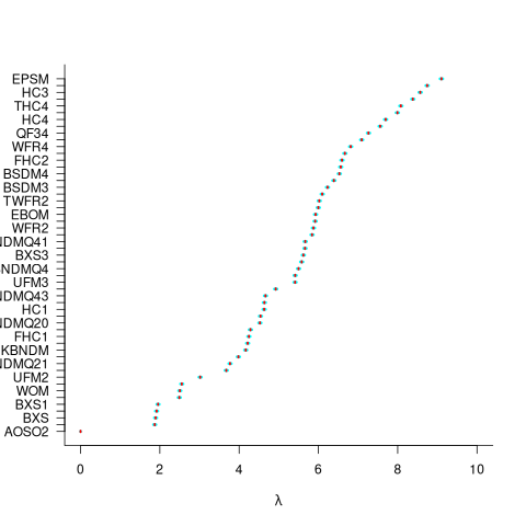
The EPSM algorithm makes use of the SSE and AVX instructions, supported by modern x86 processors, that can operate on up to 512 bits at a time.
The following table lists the fitted lambda values for the top eight ranked algorithm implementation:
 Algorithm    Lambda
      EPSM    9.103007
      THC3    8.743377
       HC3    8.567715
      FHC3    8.381220
      THC4    8.079716
      FHC4    7.991929
       HC4    7.695787
TWFR4 7.557796 |
The likelihood that EPSM will rank higher than THC3 is } right 0.59") .
.
This is better than random, and reflects the variability in algorithm performance, i.e., there is no clear winner.
It might be possible to extract more information from the data.
Some algorithms use of the same technique for part of their search process. Information on the techniques shared by algorithms can be added to the model as covariates. Assuming that a suitable fit is obtained, the model coefficients would indicate the relative impact of each technique on performance. I don’t know enough to select the techniques, and Matt is thinking about it.
Half-life of Microsoft products is 7 years
I get a lot of pushback from developers/managers when I tell them that the average application has a relatively short lifetime, i.e., half-life of 4-8 years. The pushback kicks in when I start citing data, up until then my listeners appear surprised/skeptical. The fact that source code has a brief and lonely existence is accepted, but telling them about the (one study) evidence that a coding mistake is more likely to disappear because of an unrelated coding change than as a result of fixing a fault report appears to make them feel uncomfortable.
Some applications live a long time, and most developers will spend most of their time working on long-lived applications. Short-lived applications are not around long enough to acquire significant developer/manager mind share.
I think the pushback is rooted in more than developer experience; developers don’t like the thought of their work disappearing from the world. The desire for permanence in what we create may be a human characteristic. Extolling the creation of reliable, maintainable, readable code creates an implicit assumption that applications are going to live long enough for the cost of these activities to be paid back.
How accurate are these half-life estimates?
The 4-8 year half-life range is derived from two datasets. A while ago I spotted another dataset: Fabiano Riccardi‘s Killed by Microsoft, currently containing information on 141 killed products.
All three datasets list just the products that have been killed, i.e., they are not a list of all products. A half-life calculation based only on killed products could underestimate the actual lifetime, it depends on whether the rate of killed products remains roughly the same percentage of all products or not. If the number of products killed, in any period, is always roughly the same percentage of all current products, then the calculated lifetime is not affected by the lack of data on the number of live products. Uncertainty in the calculated lifetime is created when the number of products killed is unconnected with the current number of live products.
It’s possible, to save money, products are more likely to be killed when a company is going through a period of poor performance, or the economy is in recession, compared to when business is booming.
Another source of uncertainty is sampling bias. Companies announce when products are released/withdrawn, creating recency bias because it’s easier to monitor the news than actively search for data on past product releases/withdraws. The plot below shows the number of products Microsoft killed in each year (red bars; post 2025 are to be killed-by dates) and number of new products launched each year blue/green line (code+data):
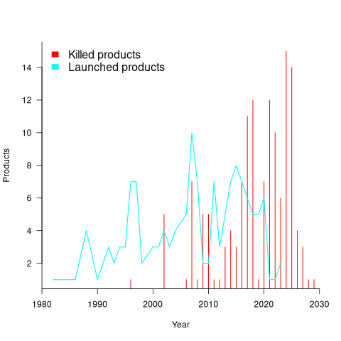
I’m sure that Microsoft killed more than one product before 2000. The Dot-com bubble burst in March 2000, and I would expect this to have resulted in lots of killed products. The lack of data on products killed before 2000 means that shorter lived products are undercounted.
The plot below shows the number of Microsoft (eventually killed) products still supported a given number of years after launch, the red line is a regression fit for products aged between 4 months and 22 years (code+data):
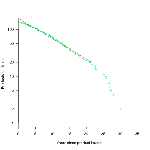
The half-life of the Microsoft products in this dataset, aged between 4 months and 22 years, is 7 years. Is the sharp decline in half-life after 22 years a real thing, or a consequence of the small amount of data before 2005? As always, more data is needed.
How has the price of a computer changed over time?
We are told that computers are now orders of magnitude cheaper than they once were. Computers have changed an awful lot over the last 70 years; how is the functionality supported by different computers normalised such that the price of computers from long ago can be compared with today’s computers?
One approach is to narrow the question down to calculating the cost of performing some basic operation, e.g., numerical calculation or sorting a list of values. Nordhaus’s famous paper: Two Centuries of Productivity Growth in Computing uses this approach.
The primary advantage of the cost-of-operation approach is that it can be made to work across the complete range of computing platforms. The major disadvantage of this approach is that it focuses on the performance of the cpu/memory, ignoring the ability to store large amounts of data and perform I/O (which is most of the cost of some computer systems).
The US consumer price index (CPI) uses Hedonic regression to adjust the average price of a product family whose quality changes over time (the CPI is used to track inflation, and so every price needs to be for a product identical to the exemplar chosen at some start date). Hedonic pricing models are also used to understand how specific features within a product category (e.g., housing, automobiles, or electronics) contribute to the price. The term hedonic is derived from hedonism, and was first used in a 1939 paper analysing the price/quality of automobiles.
The 1979 paper “Hedonic Prices and the Structure of the Digital Computer Industry” by R. Michaels (cannot find a downloadable copy) appears to have kick-started the computer/hedonic research rabbit hole (the 1969 book “The Economics of Computers” by W. F. Sharpe covers computer costings in detail). Hedonic regression estimates the value of a product by braking it down into its major components which are used as the explanatory variables in a regression model that predicts the product price on given dates, e.g., for mainframe computers: price, cpu speed, amount of memory, number/size of hard disks, number of tape drives and card readers.
While mainframes and microcomputers share some characteristics (e.g., cpu, memory, and discs), they address different markets with very different requirements (e.g., mission-critical requires high reliability and tape backups). Different Hedonic regression models need to be fitted for each.
Gathering a representative sample of information on all the major components of a product, preferably for each year, is a lot of work. Many papers make use of information from proprietary databases. A lot of historical information is now available in scanned trade publications, but LLMs are not yet good enough to reliably extract detailed information from scanned documents (e.g., they sometimes ignore information, rather than hallucinating). I am waiting for the error rate to decrease.
The analysis in the book chapter Computer Processors and Peripherals by R. J. Gordon spends a lot of time dealing with the issues around potentially inconsistent data sources. The final price index (table 6.7) shows that the normalised price of mainframes decreased by a factor of 922 between 1951 and 1983 (23% per year, for 33 years). That is, the equivalent 1951 mainframe purchased in 1983 would have been cheaper by a factor of 922. In practice, prices did not decrease by a factor of 922, rather some combination of price/quality of the average mainframe changed by this factor (where quality is some combination of faster cpus, more memory and other factors). For an analysis of computer related products see the book “Price Measurements and Their Uses” by Foss, Manser, and Young.
The price of microcomputers (or computers as we call them today, as there is little public perception of any other type of computer) has decreased, but by how much (in the Hedonic sense)?
The first Hedonic analysis of microcomputers was Cohen’s 1988 Master’s thesis, for personal computers between 1976 and 1987. I think Cohen is pushing product family boundaries to treat the 8-bit computers introduced before the IBM PC in August 1981 (which did not include a hard disk until 1983, and did not really become a 16-bit computer until the IBM AT in 1987) as being comparable with later microcomputers. Cohen’s analysis found positive/negative swings in the adjusted prices of the microcomputers.
The paper Price and quality of desktop and mobile personal computers: A quarter-century historical overview by Berndt, Dulberger and Rappaport claim that there was an average annual 27% decline in microcomputer prices between 1976 and 1999. Again, my comments on pre-1987 microcomputers applies. A later paper (appendix table 1) shows average actual prices increasing until 1991 and decreasing thereafter, with the averages of cpu frequency, memory capacity and hard disk size continually increasing. There was little difference in the prices at the start(1976)/end(2002) of the period analysed, but a huge difference in the quality characteristics. While writing my Evidence-based software engineering book, I emailed Berndt for the data, which a co-author kindly made available. Unfortunately, I found that much of the data was confidential (the name of a company that sold computer sales data appeared in the files), and could not be publicly shared 🙁
Hedonic analysis of computers appears to have become unfashionable around the start of 2000. More recent papers analyse products such as mobile phones and cloud services. Please leave a comment if you know of any recent hedonic analysis of computer prices.
The only detailed microcomputer price data I know of consists of 6,259 detailed prices collected by Stengos, and Zacharias over 35 months, starting in January 1993, from the adverts in PC Magazine.
CPU frequency not relevant to SPEC benchmark performance
Despite the end of Dennard scaling around 2005-7 computer performance, as measured by the SPEC cpu benchmarks, continues to improve. What is driving this ongoing increase in performance, given that cpu clock rates have stopped increasing?
The plot below shows 9,161 results from the SPEC CPU integer benchmark, plus the fitted regression line  (code+data):
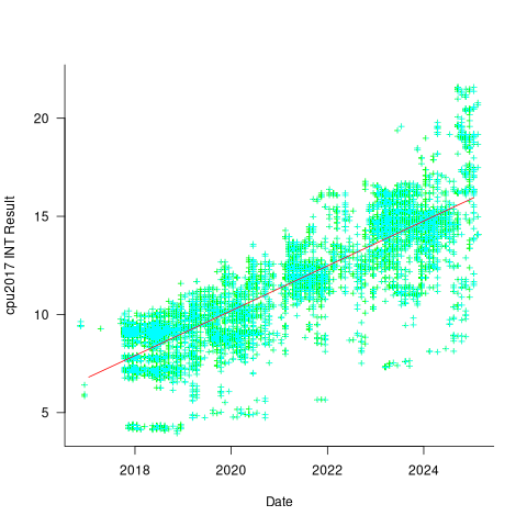
There is a scattering of benchmark results because manufacturers offer systems having a range of performance.
Possible factors driving the ongoing increases in system performance include increased DRAM-memory bandwidth, and cpu improvements such as larger caches and more accurate branch prediction. While Moore’s law (i.e., rate of growth of the number of transistors on a chip) has slowed down a lot, the number of transistors in a processor chip has continued to increase (many of these transistors have been used to build chips that contain multiple cpu cores).
The SPEC benchmark result data includes a lot of information about the system that ran the benchmarks, including: processor family/model, number of cpu cores, clock frequency, amount of memory installed and its type.
Results from SPEC CPU2017, the current version of the benchmark, are available from the start of 2017 to now. The following analysis uses these results. Results from the SPEC CPU2006 benchmark are also available, and a regression model fitted to the results from the 780 systems that ran both benchmarks, gives the mapping from CPU INT 2006 to CPU INT 2017 as:  .
.
The processor information in the results file usually specifies family name plus model number/name. The model information usually correlates with clock frequency, perhaps cache size, or gpu support; some examples below.
    AMD EPYC 4464P                AMD EPYC 4564P
    AMD Ryzen 9 7950X             AMD Ryzen 7 5800X
    Intel Xeon Platinum 8490H     Intel Xeon Gold 6438N
Intel Xeon E3-1220 v3 Intel Xeon E5-2697 v3 |
The family name is sufficient for an initial analysis. Details of any cache size differences between models can always be included in a later analysis. The following table shows the number of processor x86 based families present in the 2017 INT results (total 9,161):
           AMD EPYC           AMD Ryzen               Intel
               1475                   7                   1
      Intel Celeron       Intel Core i3       Intel Core i5
                 16                  31                   2
      Intel Core i7       Intel Pentium          Intel Xeon
                  1                  30                 605
  Intel Xeon Bronze        Intel Xeon D       Intel Xeon E3
                167                  12                  16
      Intel Xeon E5       Intel Xeon E7     Intel Xeon Gold
                  3                   2                3994
Intel Xeon Platinum   Intel Xeon Silver        Intel Xeon W
1822 969 8 |
The memory information usually includes total bytes, number of memory sticks and interface standard (e.g., DDR2/3/4/5); some examples below.
    64 GB (2 x 32 GB 2Rx4 PC5-5600B-R, running at 5200)
    64 GB (2 x 32 GB 2Rx8 PC4-3200AA-E)
    256 GB (8*1GB DDR2-400 DIMMS per 4 core module)
    192 GB (4 x 12 x 4 GB DDR3-1333R, ECC, CL9)
    32 GB (8 x 4 GB Dual-rank PC2-6400 CL5-5-5 FB-DIMMs)
24 GB (6 x 4 GB DDR3-1333 downclocked to 1066 MHz) |
The memory bandwidth can be calculated from the interface standard used. The names of modern DRAM interface standards start with either DDR or PC, and a number, a hyphen and then another number. The values appearing in the SPEC results don’t always follow the naming rules listed in the standard (e.g., last number of a PC name using the corresponding DDR number), and in a few cases a digit was dropped from the last number. Where possible the ‘obvious’ edits were made (sometimes values were just wrong), see code for details. The following table shows the number of interface standards represented in the 2017 CPU INT results (total 9,161; in the 2006 results DDR names predominated):
PC4-2400  PC4-2666  PC4-2933  PC4-3200  PC4-4800 PC5-11200 PC5-12800
      26      2248      2163      2080         6         2         3
PC5-4800  PC5-5200  PC5-5600  PC5-6400     PC5-8  PC5-8800
1735 5 653 233 2 5 |
Once the memory is identified, its bandwidth can be looked up (bespoke memory stick clock rates were ignored). Fitting a regression model to the data, with the CPU INT (cpu integer benchmark) result as the outcome, we get (using a multiplicative model allows each factor to have a percentage impact; code+data):

where:  is the memory bandwidth in megabytes per second,
  is cpu frequency in MHz, and
  is the fitted constant for each processor family.
The cpu frequency varies between 1.7 and 4.7 GHz (a ratio of 1:2.8), the memory bandwidth between 19,200 and 51,200 MB/s (a ratio of 1:2.7), and processor family performance impact ratio was 1:2.2. Given the fitted power laws, this range of cpu frequencies could impact performance by around 22%, while the range of memory bandwidth could impact performance by a factor of two.
This fitted model implies that cpu frequency changes, over the range supported by systems since 2017, have almost no impact on the performance of integer-based programs, i.e., no floating point.
I thought there might be a correlation between memory bandwidth and cpu frequency (because vendors would use faster memory in systems with faster cpus). The plot below shows CPU frequency against memory bandwidth (both axis use linear scales), plus a fitted regression line in red (code+data):
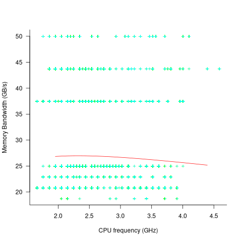
I was wrong. There does not appear to be any connection between a system’s cpu frequency and its memory bandwidth.
These days, most x86 chips include multiple processors, with each processor taking a share of memory bandwidth. Increasing memory bandwidth is essential, if all cores are to be kept busy.
The SPEC CPU benchmark measures the performance of a single processor. If only one of the cpu cores available on a system is being used, that core has the benefit of memory bandwidth that usually has to be shared.
To what extent is a single core benchmark relevant today? I suspect that most programs run on a single core, but developers sometimes attempt to spread cpu intensive programs over multiple cores. As always, data is needed.
The SPEC benchmark is useful for cpu designers (the original target market) and compiler writers wanting to measure the impact of fancy new optimizations.
Repo of software estimation datasets
I have finally gotten around to creating a GitHub repository for the publicly available software estimation datasets. My reasons for doing this include increasing the visibility of the large datasets, having something to reference when I tell people about the miniscule size of most of the datasets modeled in research papers (one of my most popular posts explains why software estimation is mostly fake research), and to help me remember what datasets I do have.
There is a huge disparity in dataset sizes. The main reason for this is that some datasets contain one row for each task within a project, while others contain one row for the whole project.
The Albrecht dataset from 1983 contains 24 rows, and I’m treating it as the minimum size for a dataset to be included in this repo. Smaller datasets have been published, but I don’t see any value including them. Albrecht is only included because it is used by earlier papers.
The current state of knowledge about the characteristics of individual task estimates is discussed in an earlier post.
What of the row per project datasets? Other than overestimates being common, there is not enough data to reliably spot/claim recurring project patterns across datasets. The estimates have probably occurred in a competitive environment, i.e., there is an incentive to bid low. The common techniques used to estimate projects are either based on counting Function points, or on estimating the number of lines of code contained in the delivered system (this value, plus other values, is plugged in to a cost estimation model, e.g., COCOMO).
The problem with estimating using LOC (which is itself estimated) is that there can be large differences in the number of LOC written by different developers to implement the same functionality.
The datasets in the initial upload include those that are commonly cited in research papers, and those analysed on this blog. I will probably discover (i.e., remember) more datasets in the coming weeks, as happened for the repository of reliability datasets created a few months ago.
Deep dive looking for good enough reliability models
A previous post summarised the main highlights of my trawl through the software reliability research papers/reports/data, which failed to find any good enough models for estimating the reliability of a software system. This post summarises a deep dive into the technical aspects of the research papers.
I am now a lot more confident that better than worst case models for calculating software reliability don’t yet exist (perhaps the problem does not have a solution). By reliability, I mean the likelihood that a fault will be experienced during 1-hour of operation (1-hour is the time interval often used in safety critical standards).
All the papers assume that time to next new fault experience can be effectively modelled using timing information on the previously discovered distinct faults. Timing information might be cpu time, or elapsed time during testing or customer use, or even number of tests. Issues of code coverage and the correspondence between tests and customer usage are rarely mentioned.
Building a model requires making assumptions about the world. Given the data used, all the models assume that there is a relationship connecting the time between successive distinct faults, e,g, the Jelinski-Moranda model assumes that the time between fault experiences has an exponential distribution and that the exponent is the same for all faults. While the Jelinski-Moranda model does not match the behavior seen in the available datasets, it is widely discussed (its simplicity makes it a great example, with the analysis being straightforward and the result easy to explain).
Much of the fault timing data comes from the test process, with the rest coming from customer usage (either cpu or elapsed; like today’s cloud usage, mainframe time usage was often charged). What connection does a model fitted to data on the faults discovered during testing have with faults experienced by customers using the software? Managers want to minimise the cost of testing (one claimed use case for these models is estimating the likelihood of discovering a new fault during testing), and maximising the number of faults found probably has a higher priority than mimicking customer usage.
The early software reliability papers (i.e., the 1970s) invariably proposed a new model and then checked how well it fitted a small dataset.
While the top, must-read paper on software fault analysis was published in 1982, it has mostly remained unknown/ignored (it appeared as a NASA report written by non-academics who did not then promote their work). Perhaps if Nagel and Skrivan’s work had become widely known, today we might have a practical software reliability model.
Reliability research in the 1980s was dominated by theoretical analysis of the previously proposed models and their variants, finding connections between them and building more general models. Ramos’s 2009 PhD thesis contains a great overview of popular (academic) reliability models, their interconnections, and using them to calculate a number.
I did discover some good news. Researchers outside of software engineering have been studying a non-software problem whose characteristics have a direct mapping to software reliability. This non-software problem involves sampling from a population containing subpopulations of varying sizes (warning: heavy-duty maths), e.g., oil companies searching for new oil fields of unknown sizes. It looks, perhaps (the maths is very hard going), as-if the statisticians studying this problem have found some viable solutions. If I’m lucky, I will find a package implementing the technical details, or find a gentle introduction. Perhaps this thread will have a happy ending…
An aside: When quickly deciding whether a research paper is worth reading, if the title or abstract contains a word on my ignore list, the paper is ignored. One consequence of this recent detailed analysis is that the term NHPP has been added to my ignore list for software reliability issues (it has applicability for hardware).
Zig is the next fashionable language
New programming languages are constantly being created, with most remaining unknown outside a small circle of friends. Every 5-10 years or so, a few of these languages break out to become fashionable to use. In the early 1980s, I was a fan of Pascal and had conversations with developers trying to figure out why they were fans of C. Yes, C was once the fashionable language to talk about. One of these languages went on to be used almost everywhere, while the other had the common fate of fading into obscurity.
Fashion serves a purpose. People, not just developers, enjoy experimenting, feel a need for self-expression, with a “fresh start” making them feel new and energized. Following fashion provides a means of fulfilling these desires. Developers who don’t need to earn a living using established languages are able to invest their time being part of the growing community of the current fashionable language.
Over the last 5-10 years Rust and Go were fashionable languages, with Julia being part of the trend vibe for a few years in the mid 2010s.
This last year, I have noticed a significant decline in articles extolling Go and meeting developers using it. In the last 6 months, I have seen a marked growth in criticism of Rust (very slow compilation speed in particular).
Fashion requires change and reinvention, because widespread use ruins its specialness. When Rust is no longer perceived to be fashionable (I think Go is already at this point), a new language will be ‘chosen’ to fill the void. Which languages are the likely candidates?
For some time, I have been telling people that my candidate language is Zig. My original whimsical reason was that very few programming languages have names starting with letters near the end of the alphabet (the preponderance of language names start with a letter near the beginning).
Experience has taught me that technical merits have little to do with language choice, clearly illustrated by the wide use of PHP and JavaScript.
A necessary condition for a language to become fashionable is that it be usable on the widely available software development platforms of the day (which is how PHP and JavaScript catapulted their user growth), another is that there be at least one core developer generally available to respond to user questions. The first condition provides something to use, and the second the basis for a welcoming community.
New languages are created on a regular basis by PhD students, but these implementations are a means to an end, i.e., publishing papers about some technique. There might be something to use, but rarely a welcoming community.
Andrew Kelley, the creator of Zig and president of the Zig foundation, quit his job in 2018 to work full-time on Zig. Andrew has put a lot of effort into building a community and raising funds to hire people.
Doing all the necessary things is not enough, there is luck and timing is important. The start date for Zig is four years after the start date for Rust. Not long enough for Rust to become unfashionable and need a replacement. However, seven years after leaving his job, Andrew is still working on Zig. Persistence is also an important success factor.
While I don’t actively follow Zig, I do visit sites where fringe languages are regularly discussed. Over the last six months, there has been a noticeable increase in Zig related discussions, and somebody has written a Zig book. Given that Zig related discussions are uncommon, this uptick may just be noise.
To me, Zig looks ready to go, and also has an appealing backstory (i.e., created by a lone developer working hard over many years) that contrasts with the Rust/Go perceived backstory (i.e., created in the bowls of an, not at the time, ‘evil’ corporation). I have not seen any other contenders for the next fashionable language.
Will LLMs cause fashionable languages to stop being a thing? Perhaps in the long term, or perhaps a new criterion for being fashionable will be not-known to LLMs. At the moment, developers are very aware of the failing of LLM code generation. In the short term, I think that fashionable languages will remain a thing.
Apollo guidance computer software development process
MIT’s Draper Lab implemented the primary Guidance, Navigation and Control System (GNCS) for the Apollo spacecraft, i.e., the hardware+software (the source code is now available on GitHub). Project Apollo ran from 1961 to 1972, and many MIT project reports are available (the five volume set: “MIT’s Role in Project Apollo” probably contains more than you want to know).
What development processes were used to implement the Apollo GNCS software?
For decades, I was told that large organizations, such as NASA, used the Waterfall method to develop software. Did the implementation of the Apollo GNCS software use a Waterfall process?
Readers will be familiar with the wide gulf that can exist between documented management plans and what developers actually did (which is rarely documented). One technique for gaining insight into development practices is to follow the money. Implementation work is a cost, and a detailed cost breakdown timeline of the various development activities provides some insight into the work flow. Gold dust: Daniel Rankin’s 1972 Master’s thesis lists the Apollo project software development costs for each 6-month period from the start of 1962 until the end of 1970; it also gives the number of 16-bit words (the size of an instruction) contained in each binary release, along with the number of new instructions.
The GNCS computer contained 36,864 16-bit words of read-only memory and 2,048 words of read/write memory. The Apollo spacecraft contained two GNCS computers. The plot below shows the cumulative number of new code (in words) contained in all binary releases and the instructions contained in each binary release, with Apollo numbers at the release date of the code for that mission; grey lines show read only word limit and read-only plus twice read/write word limit (code+data):
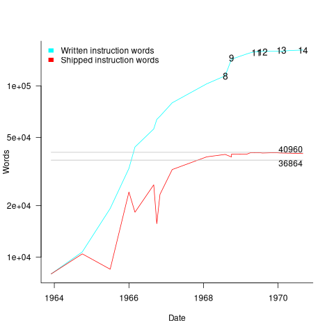
Four times as many instructions appeared over all releases, than made it into the final release. The continual turn-over of code in each release implies an iterative development process prior to the first manned launch, Apollo 8 (possibly an iterative waterfall process). After the first moon landing, Apollo 11, there were very few code changes for Apollo 12/13/14 (no data is available for the Apollo 15/16/17 missions).
The plot below shows thousands of dollars spent on the various software development activities within each 6-month period; the computing items are the cost of computer usage (code+data):
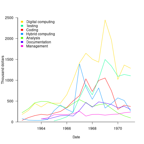
The plot suggests that most activities are ongoing over most of the decade. As expected, Coding costs significantly decrease before the release used during the first Moon landing, and testing costs continue at a high rate across the Apollo 11/12/13/14 missions. Why didn’t the Documentation costs go down when the Coding costs went down? Perhaps this was for some upcoming changes (not the Lunar rover which was built by Boeing). Activities in the legend are ordered by total amount spent; totals below:
Digital_Computer $18,373,000 Testing $ 9,786,000 Coding $ 8,233,000 Hybrid_Computer $ 7,190,000 Analysis $ 6,580,000 Documentation $ 4,177,000 Management $ 2,654,000 |
I think this data clearly shows that the Apollo GNCS software was developed using an iterative approach, and given that the cost of Coding was only twice as much as Documentation, within these iterations some form of Waterfall process was probably used.
Creating a global Standard requires being politically neutral
Governments actively promote Standards because following them saves their citizens time and money. The UK and US have contrasting rationales, with the UK focusing on savings achieved through repeated use of standardized items and the US focusing on the repeated use of skills people acquired through using a standardized item (i.e., reduced training costs).
Manufacturers wanting to export products want to be able to ship identical products all over the world, i.e., not have to make costly changes for different national markets. To be able to do this, they need the rest of the world to have a Standard way of doing things. The once dominant military and industrial status of Great Britain, and now the US, motivated them to create and encourage other countries to follow the Standards they created.
These days, most programming language Standards work is done by people employed by US companies attending an international committee, SC22, with (currently) 28 countries paying to be P (participating) members and 21 countries as O (observing) members (most countries don’t appear to have any active involvement in language standards). The reason for the dominance of US companies is that few non-US companies are willing to fund staff to do Standard’s work. For a few languages SC22 essentially rubber stamps documents produced elsewhere, e.g., most of the Cobol work used to be done by a US committee and ECMAScript (aka JavaScript) work is done in a European committee mostly attended by US companies.
Other countries sometimes get to dominate the creation of a language Standard, e.g., the UK led the Pascal Standard work. At the last SC22 meeting, a person from the US lamented that Europe was set to become the dominant driver of the Ada Standard. I resisted the urge to cheer: Make Europe Great Again.
Getting an international Standard adopted throughout the world requires that ISO be politically neutral and accept any sovereign country as a member (provided they pay the membership fees). For instance, North Korea is a member of ISO.
The only politics I have previously seen in programming language standard meetings has involved company rivalry, not geopolitical rivalry. A recent request for comment from SC2 (the ISO committee responsible for coded character sets; readers are more likely to be familiar with Unicode, essentially the same information published by a non-profit consortium based in California) looks like geopolitics, in the sense of geopolitical virtue signalling.
The document is: Request for SC2 member comments on proposal to encode “Ruble sign with double vertical stem”. What does the character “Ruble sign with double vertical stem” look like? To quote the document: “The proposed character is a text element that cannot be represented by any existing character or character sequence.” Readers will have to imagine Russia’s Ruble currency symbol, ₽, with two vertical stems (I assume these stems are short antennae like lines).
What is the geopolitical connection? Readers will be aware of Russia’s invasion of Ukraine, but may not be aware of Russia’s involvement in Transnistria (quoting Wikipedia, “… a landlocked breakaway state internationally recognized as part of Moldova.”). Since 1994, the proposed character has been used as the Transnistria currency symbol.
The request for comment includes a “Non-technical considerations” section summarises various controversy points, and finishes with: “We are not aware of any non-technical criteria having been used by SC2 or WG2 in the past that could be applied to disqualify this character. We are also concerned that adopting a criterion that allows for opposing a character because of association with politically or socially defined user communities could be problematic.”
The proposed character is not included in ISO 4217 (which defines numeric codes for the representation of currencies). However, SC22 does not require that a character used to represent a currency be included in ISO 4217. Previously, SC22 has accepted currency characters that are not in ISO 4217.
Is this a one-off objection, or does it mark the start of a stream of requests to remove one or more politically incorrect characters from ISO 10646/Unicode?
A lot of people put a lot of effort into creating a unified Standard for all the characters created by the World’s people. I hope the destructive nature of virtue signalling does not take hold in programming language Standard ecosystem.
Comparing developer/LLM coding performance
Lots of claims are being made about how LLMs will soon outperform developers on coding tasks. Given the lack of any effective measure of developer performance, these claims are meaningless. At some point, lower costs will entice management to accept good enough LLM performance as a replacement for human developers, i.e., LLM don’t need to be technically better than developers.
The outperform claims are, currently, marketing puff, and I was not expecting anybody to make a serious attempt to compare developer/LLM performance. However, concerns about AI exceeding human capacity to control it (and maybe wiping out humans) has resulted in some well funded AI safety research groups. There is at least one group actively recruiting developers to “… establish human performance baselines on tasks related to software engineering, machine learning, and cybersecurity …”.
The most talked about AI threat scenarios all seem to start with recursive self-improvement, i.e., LLMs training themselves, exponentially improving with each iteration (the implied exponential always seems to be continuously up, rather than getting exponentially closer to a maximum).
Can current LLMs improve themselves faster than a developer can?
Implementing a new LLM is beyond the ability of today’s LLM, but they can implement some of the components used to build an LLM. How does LLM performance compare against developers, on the implementation of these components?
The paper RE-Bench: Evaluating frontier AI R&D capabilities of language model agents against human experts from METR (Model Evaluation & Threat Research) comes with code and “… anonymized human expert data coming soon.” for seven tasks. The baseline was derived from the performance of 61 human experts.
I’m always pleased to see researchers doing experiments with developers. I wish there were more groups doing this kind of thing.
However, I think that these researchers have made the common mistake of using very complicated subject tasks in their experiment. Most software development tasks are mundane, with the occasional complicated task (which can often be solved by using an appropriate package/library). The tasks may be representative of the harder tasks that need to be done, but they are not representative of the complete LLM implementation scenario.
A consequence of using complicated tasks is that most subjects only had enough time to complete one task (they were given 8 hours). With so few tasks (seven) the confidence intervals are going to be very wide on any general statement about human/LLM performance. With around ten subjects per task, the individual task confidence intervals are also going to be wide.
Task 7 made me laugh: “… that generates solutions to CodeContests problems in Rust, …”
Why Rust? Did they happen to have access to lots of Rust experts, or does the research group contain enthusiastic fans of Rust? I suspect the latter. There is a certain kind of highly intelligent developer who strongly believes that writing programs in a particular language imbues the code with magical properties (their rationale won’t be worded that way). For the last few years, Rust has been one of these pixie dust languages. Many decades ago, C had this charisma.
Perhaps each generation of ever more ‘intelligent’ LLMs will choose to design a new language to use to implement their ‘successor’.
There are a myriad of tasks related to software engineering. Solving GitHub issues is a thankless task, and having LLMs reliably close open issues would be of enormous benefit. A study published two months ago obtained a 1.96% solution rate (no explicit testing of developers).
Recent Comments